Website renewal 🤩
I’ve open-sourced the code for my website on GitHub - feel free to tinker with your own version here.
Three months with Github Page.
It’s hard to believe it’s already been three or four months since I created this website. At this stage of life, I value archiving memories in ANY form, so I’m recapping my experience building this site.
I had to learn Visual Studio, GitHub, and Jekyll (specifically the al-folio template) to construct the site. As I described earlier, picking up these new skills as a non-programmer was a steep curve! However, I appreciate everything being free - no URL fees, unlimited uploads, embedding abilities.

The mobile experience can be glitchy, like my CV not displaying on certain browsers. But overall, I like having full control to add anything I want by finding solutions through Google. In just a few months, I’ve gained new tech skills while creating a personalized platform to preserve memories. Though challenging at times, it’s been a worthwhile endeavor.
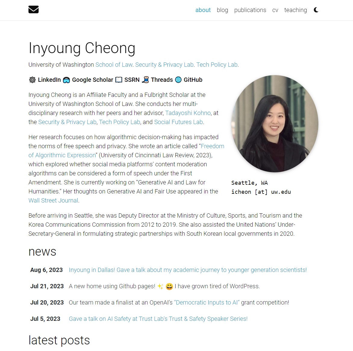
What I didn’t like about the previous version.
However, as you can see, I haven’t uploaded as much academic writing on tech law as I would have liked. These topics require critical thinking and substantial literature review. Staring at the blank screen in Visual Studio soon sapped my motivation for such mentally taxing writing. The programmer-like working environment poses a major obstacle, unless I’m doing something inherently enjoyable like a book review or reunion announcement for my Korean friends.
Because I was preoccupied with learning the basics of Jekyll and GitHub Pages, I didn’t make many customizations to the Al-folio template.

However, there were a few points I wasn’t satisfied with:
- Limited news items. Some people have long publication lists which look impressive (e.g. Chan Young and Amy).
- Al-folio is very popular, so many sites look identical. I wanted my site to have an authentic style.
- Fancy icons for selected publications take up too much space.
- As my blogging becomes more personal, people in my professional network may not need to see these posts on the main page.
My partner 👨🏻🎨 gave me candid feedback on my lengthy intro paragraph: "Nobody will read all this." He suggested highlighting just my core titles like PhD Candidate and OpenAI grant recipient. Additional details could live on separate pages, avoiding one dense intro. While implementing separate pages felt too complex, I did add resume-style hashtags below my headshot.
Website Redesign: Key enhancements
Thus, I made the following enhancements:
- Altered the color theme using Pantone color palette.
- Font change powered by Google fonts.
- Removed the affiliation from my subtitle to streamline the header and draw focus to my name.
- Moved links to my LinkedIn, Google Scholar, etc. to the bottom of the introduction to declutter the sidebar.
- Updated my headshot with a more casual photo.
- Centered my profile photo with ample whitespace on both sides for a clear look.
- Added hashtags highlighting my core research areas and projects to allow visitors to quickly identify my work.
- Displayed my publications and talks on the homepage itself and organized them chronologically by year.
The current homepage looks like this:

Overhauling my site's appearance took about two full days of effort. It required substantial work, but was time well spent to achieve a more polished, personalized aesthetic. With this updated design, Hopefully, it will further engage me in producing more website content.🤞
Enjoy Reading This Article?
Here are some more articles you might like to read next: